Flexbox in practice
tutorial on CSS development
As promised in this article you and I are going to be putting the flexbox properties that we learned in the last article to use. I’m going to be making 3 assumptions:
- You have a mobile device. A laptop or a phone. Yes, you can code with your phone. If you don’t believe me click here.
- You know how to type. If not, on your keyboard, simply push the buttons with the symbols that resemble the ones being displayed on your screen
- You have a code editor that you’re comfortable with. I’ll be using VS code.
- You have a basic understanding of HTML and CSS
Let’s begin
Before we start we first have to set up our playground by following these 3 steps:
- Create a new directory(folder) and name it “practise”
- Create a new file in this directory and name it “index.html”
- Lastly, create a new file in the same directory and name it “style.css”
Okay, it’s coding time at last:
First, in our HTML file, “index.html”. Let’s type the following code into it.

- Above, we made a basic HTML file with a
linktag in theheadtag that links to the “style.css” file that we created earlier. Then in thebodytag , we made a containerdivtag, that has 5 items which are alsodivtags.
Now unto our CSS file where the main stuff is gonna happen
- Second, in our CSS file. We’ll start by inputting the basic resets. That is:

- Next, we give our container a nice background colour and nice padding.

- Afterwhich we give our items nice padding, margin, background-color, colour, and font-size

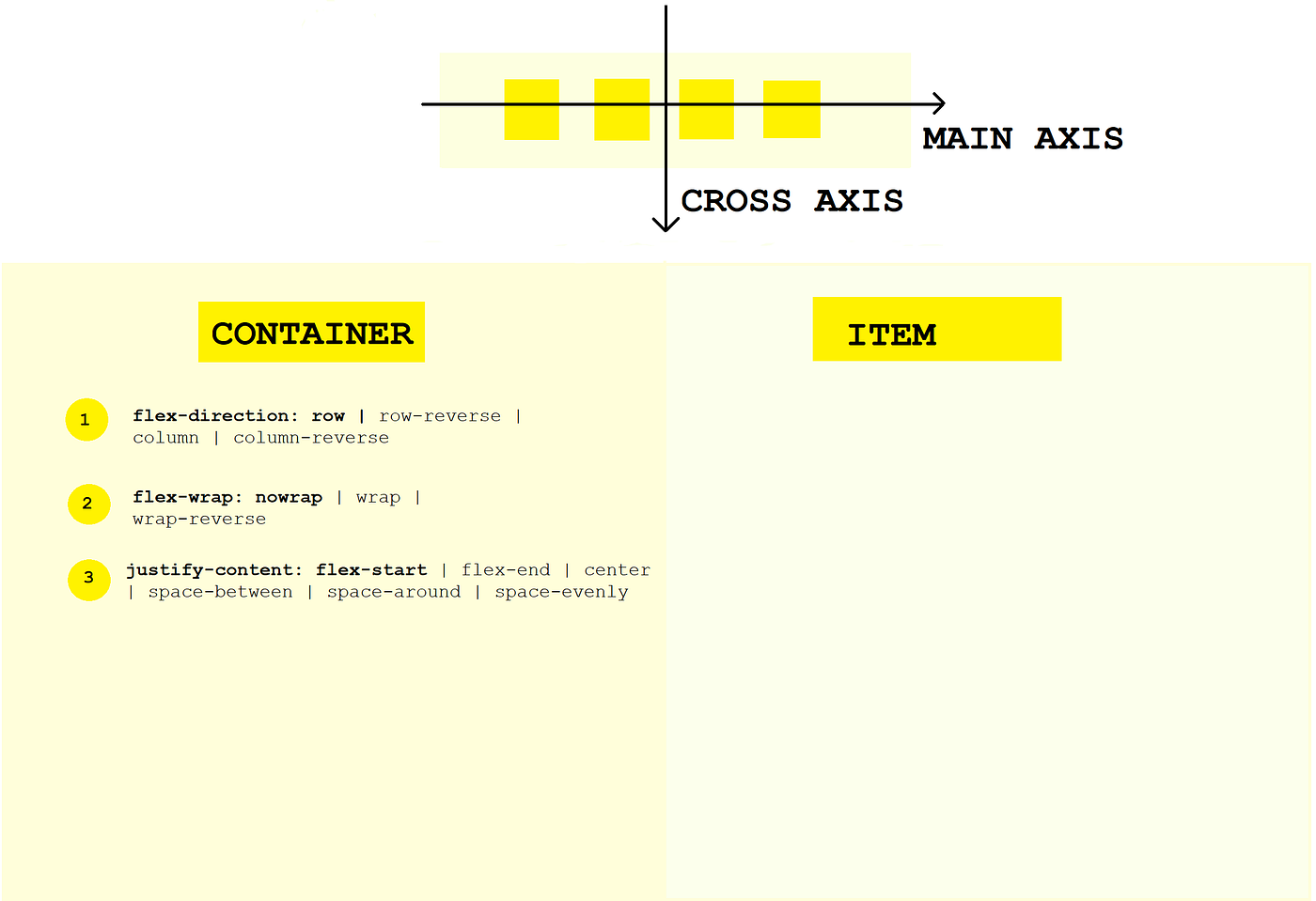
- So from the previous article, we are aware that for a flex container to have access to it’s flexbox powers you have to set its display to flex.

……………………….👇👇👇👇👇👇👇👇👇……………………………

- And immediately the default container and item properties we learned previously take effect.
………………👇👇👇👇👇👇👇👇👇👇👇👇………………………

Starting with the container properties
- The flex-direction is set to row that is the direction of the main axis is left to right
- The flex-wrap is set to nowrap
- The justify-content is set to flex-start that is the flex items line up at the beginning of the flex container
- The align-items is set to stretch
- The align-content is set to stretch
We are going to be playing with 3 of these container properties and the first one we are gonna check out is
- flex-direction: Being that its default value is row the flex items are lined up first to last in the left to right direction from the start of the flex container.

- Let’s see what happens if we change its value to row-reverse

……………….👇👇👇👇👇👇👇👇👇👇👇👇………………………..

- The direction of the main axis is now going from the right to the left. And the flex items are now starting from the end of the flex container.

- Next, let’s see what happens if we change its value to column

…………….👇👇👇👇👇👇👇👇👇👇👇👇👇👇…………………

- Ahhh, The main axis of the flex items goes from up to down and are stacked on top of each other. ( It’s quite identical to how the items were when we began before we even set the display of the container to flex)

- Lastly, let’s see what happens if we change its value to column-reverse

…………….👇👇👇👇👇👇👇👇👇👇👇👇👇………………………..

- The direction of the main axis of the flex items is now going from the bottom to the top still stacked on top of each other.

I don’t know about you but I think that is super cool. Let’s move unto another property
2. justify-content: If you can recall from the previous article this property is used to control how the items should be positioned along the main axis. Well, the default value of this property is flex-start and that’s why the flex items start at the beginning of the flex container.

- Let’s change the value to center:

……….👇👇👇👇👇👇👇👇👇👇👇👇👇👇👇👇……………………

Ah ahh, the items are automatically positioned at the center of the container.
NOTE: The space in between the items is there because of the “margin:30px” that we defined previously. If we remove it there won’t be any space in between the containers.

……….………….👇👇👇👇👇👇👇👇👇👇👇👇…………………….

So all the “center” value does is position the flex items at the center of the container
- Okay, let’s change the value to space-between

…………………👇👇👇👇👇👇👇👇👇👇👇👇…………………..

Whoa, the space in between the flex items is evenly distributed. Can you believe that flex box automatically does all these calculations for us?🤯

Another cool thing is that all of these are responsive. If you change the width of your browser the space in btw the items automatically adjust too.

Bonus: try removing the margin again and see what happens
- Let’s try the space-around value.

………………..👇👇👇👇👇👇👇👇👇👇👇👇👇👇…………………

So, although the picture above doesn’t look any different from the picture before it. This value puts the same amount of space on both the left side and the right side of each of the flex items. Meaning the space in between any two items is double the space that’s in front of the first or last item

NOTE: My arrows aren’t matching up with my words because of the margin we added. Try removing the margin.
- The next value is the space-evenly value.

……………👇👇👇👇👇👇👇👇👇👇👇👇👇👇👇👇👇……………

As we can’t see actually the picture above doesn't look that different from the other ones 😂. But this value just makes sure that the space in front of and between any flex item is always the same.

NOTE: Again, my first and last arrows aren’t matching up with my words because of the margin we added. Try removing the margin
Quick quiz: What’s the subtle difference btw space-evenly and space-around?
- Lastly, let’s try the value flex-end

……………👇👇👇👇👇👇👇👇👇👇👇👇👇👇👇👇👇……………

The flex items are positioned at the end of the container that is on the right side. Just for fun let’s see what happens if we set the flex-direction to row-reverse

……………👇👇👇👇👇👇👇👇👇👇👇👇👇👇👇👇👇……………

Lovely, hopefully you get why the image above is as it is. If not reread the gist about the flex-direction
3. align-items: This property defines how the items are aligned along the cross axis.

Setting our code back to phase one of just setting the display to flex leaves our items already perfectly aligned. So in order for this to work, we need to make one of the items bigger. So make a new class on item 2 called “i2” and set its height to something nice like 200px


There’s an immediate change, all the items also grew in height

That’s because the default value of align-items is set to stretch and at stretch, that’s what happens
- Let’s try center. That is set the value of align-items to center

……………👇👇👇👇👇👇👇👇👇👇👇👇👇👇👇👇👇……………

Cool, this time using center set the flex items to the center of the container relative to the cross axis and the biggest item.
- Let’s try flex-start

……………👇👇👇👇👇👇👇👇👇👇👇👇👇👇👇👇👇……………

Well, all the flex items are now aligned nicely at the top of the flex container relative to the cross axis. it’s the same for flex-end.

……………👇👇👇👇👇👇👇👇👇👇👇👇👇👇👇👇👇……………

Don’t forget all of these happen along the cross axis
- The last value is called baseline. To understand this value we would have to increase the font-size of any item.


Now let’s try it.


Ah Ahh, It aligns the text on the flex items along a line. So if we draw an imaginary line along with the text we’ll see that it’s all aligned. And so in…
Conclusion
That wraps up the properties that I wanted you and me to play with together because they are the most used flexbox properties. You can always check out the rest by yourself. Here use these links to read about them (justify-content, align-items, align-content). Don’t worry this isn’t the end this is just a goodbye for now. In the next article, you and I are going to be playing with the properties and values of the flex items. See you there 👈( Also If you have any questions don’t hesitate to ask me on Twitter or if you need serious tutoring you can reach me here)


